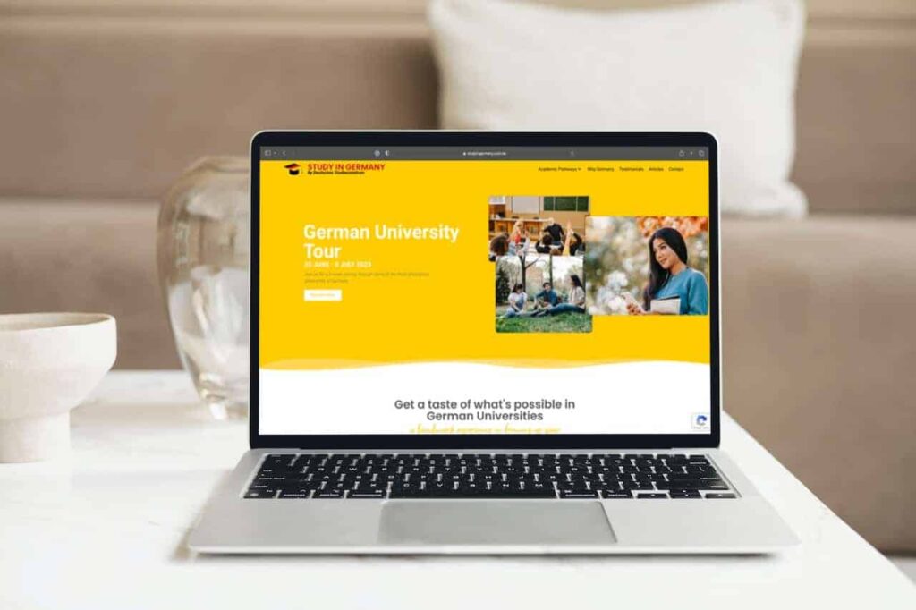
As a digital agency, we’ve worked on numerous landing pages, but when our client approached us with a text-only brief, we knew we had the challenge of creating a compelling landing page ahead of us. The client wanted to promote a summer 2023 university tour in Germany, but all they had was a text document detailing the itinerary and universities that would be visited.
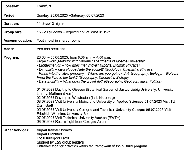
We had to turn the above text into a visually stunning and engaging landing page that would motivate potential participants to sign up for the tour. Here’s how we did it:
1. Crafting a Compelling First Impression
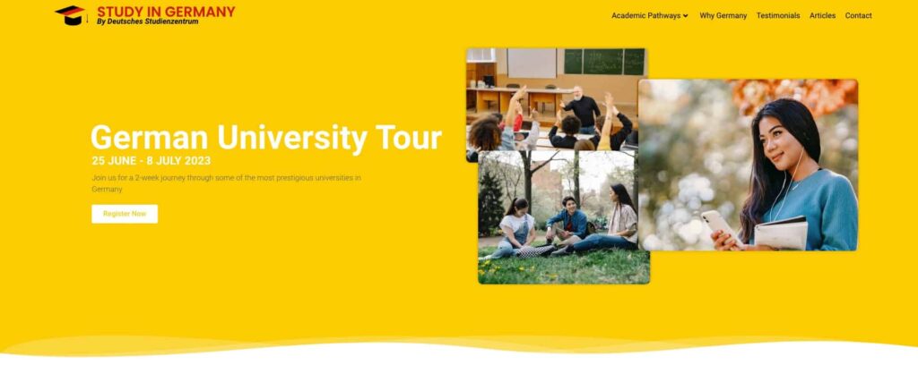
We know that users form an impression of a website in the first few seconds of landing on it. Therefore, we placed special attention on crafting a compelling first fold that communicated both textually and visually what the event was all about. We used high-quality visuals that gave a glimpse of what participants could expect on the tour, and we supported it with persuasive text that highlighted the key benefits.
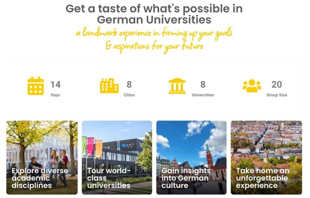
2. Highlighting the Key Benefits
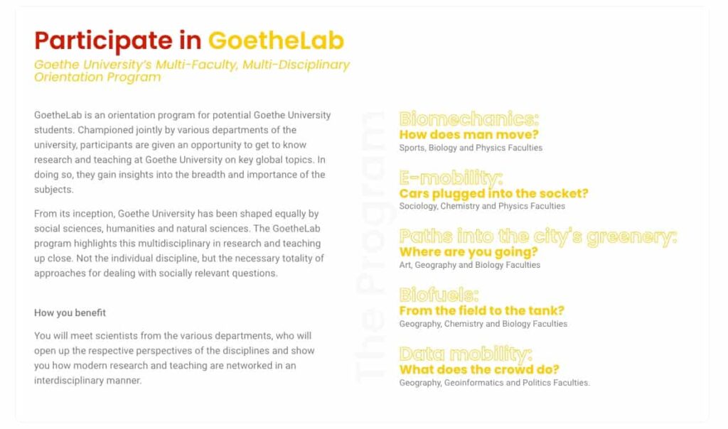
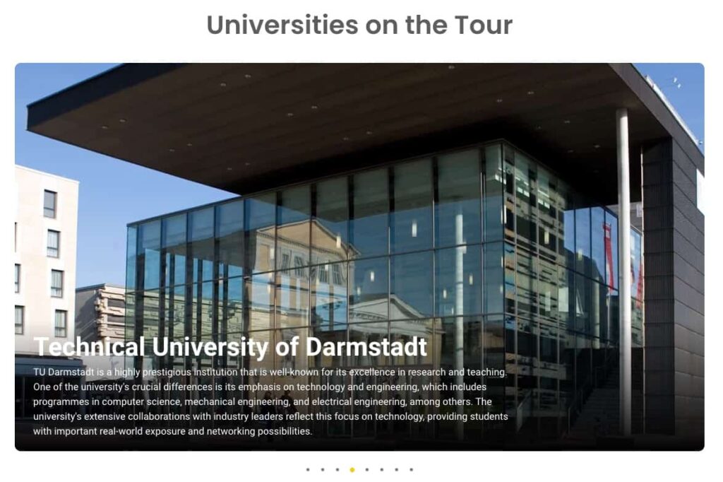
To appeal to potential participants, we knew that we had to communicate the key benefits of joining the university tour. We transformed the client’s text brief into bite-sized data that provided information about the universities that would be visited, cultural experiences, and networking opportunities. To make it more visually appealing, we used graphics and icons that supported the information.
3. A Graphical Itinerary
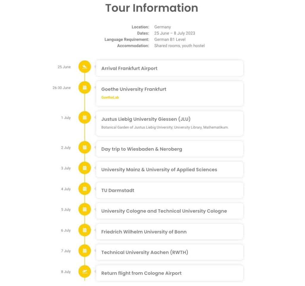
We designed a visually appealing itinerary that highlighted the tour’s route, dates of each stop and other important information. The image was created in such a manner that viewers could simply absorb and comprehend it at a look, while still providing enough depth for those who desired more information.
4. Clear Call to Action with Urgency
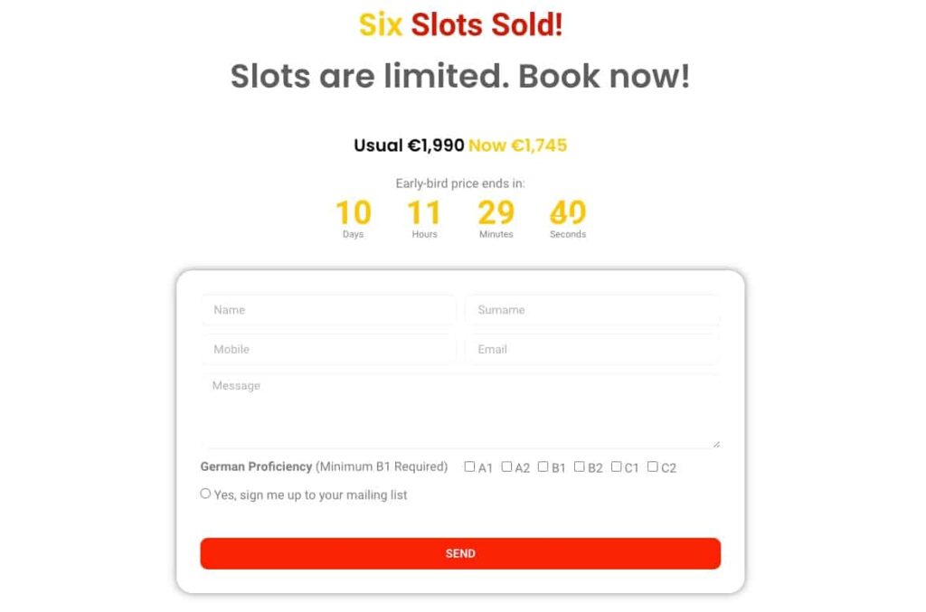
Finally, we placed a clear call to action that motivated users to take action and register for the tour. To make it more effective, we added a sense of urgency by including the number of spots available, along with a countdown timer to emphasise the limited time to register.
The landing page we created was a huge success, exceeding our client’s expectations. By focusing on the essentials of the client’s brief, using visuals to support the message, and crafting a clear call to action, we were able to create a landing page that not only looked beautiful but also achieved its purpose.
Creating a compelling landing page from a simple text brief can be challenging, but with the right approach, it can also be rewarding. By taking a user-centric approach, highlighting the key benefits, and using graphics and typography strategically, we were able to create a landing page that was visually stunning and engaging. If you’re looking to create a landing page that stands out and drives results, consider partnering with a digital agency like us to take your ideas to the next level.
